Week 6 Critique (desktop)

-Kane

Feedback

Today, we received a lot of great feedback on our website prototypes. Normally, this would be a blessing, but with the deadline looming (and other subjects to work on) we don’t have time to make the changes we would otherwise. This is really disappointing for us because we know our site could be that much better. Nevertheless, this is the feedback we received:

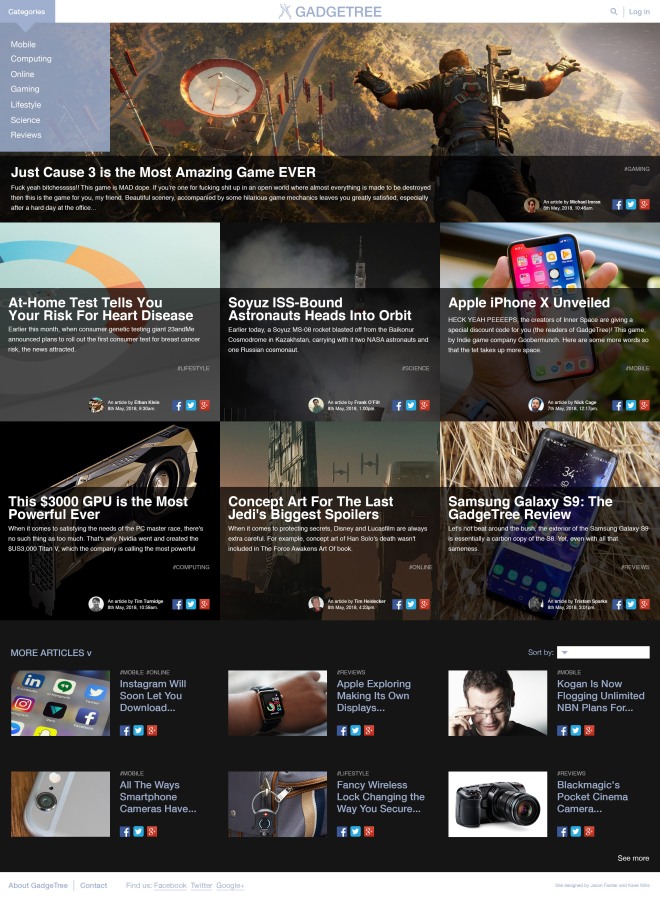
Things that are good:

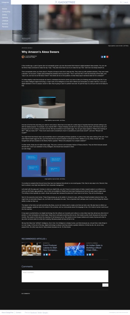
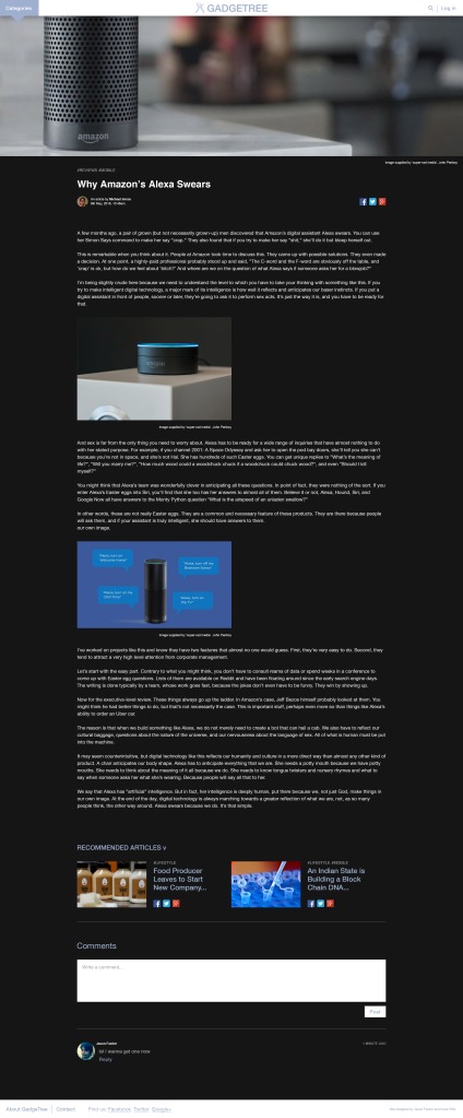
  • comment feature looks good (x3)
  • category hashtags work well
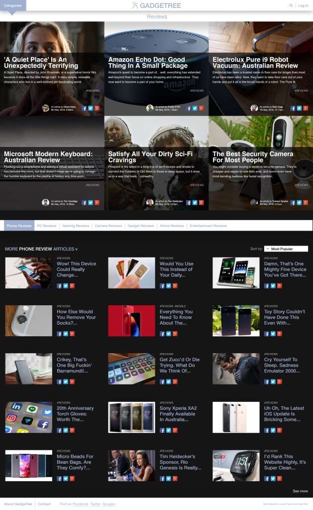
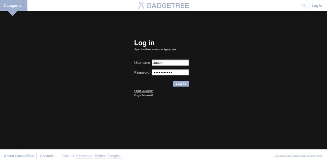
  • easy to find and find and use the login page (x3)
  • easy to find the review
  • nicely designed article page
  • great navigational flow

Things that need work:

  • white on black article text hard to read
  • author/date/time text too small (x2)
  • ‘sign up’ text on login page quite small
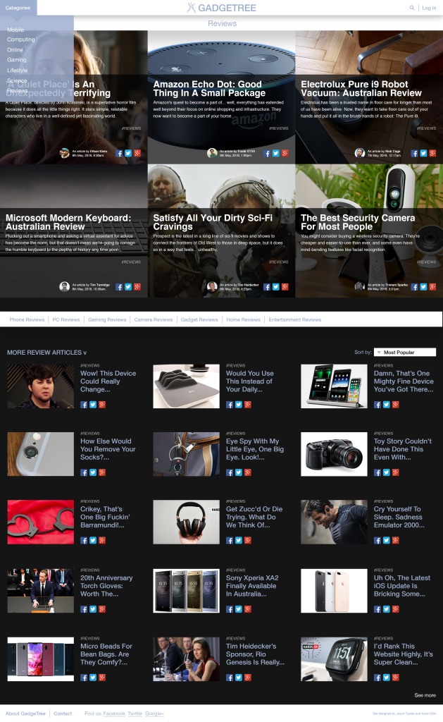
  • text hard to read on category drop-down
  • hard to find the phone review (x2)
  • homepage feels overwhelming

What we would change:

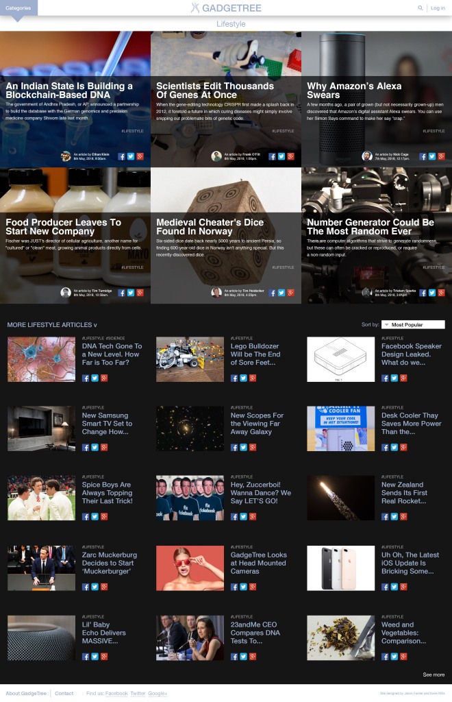
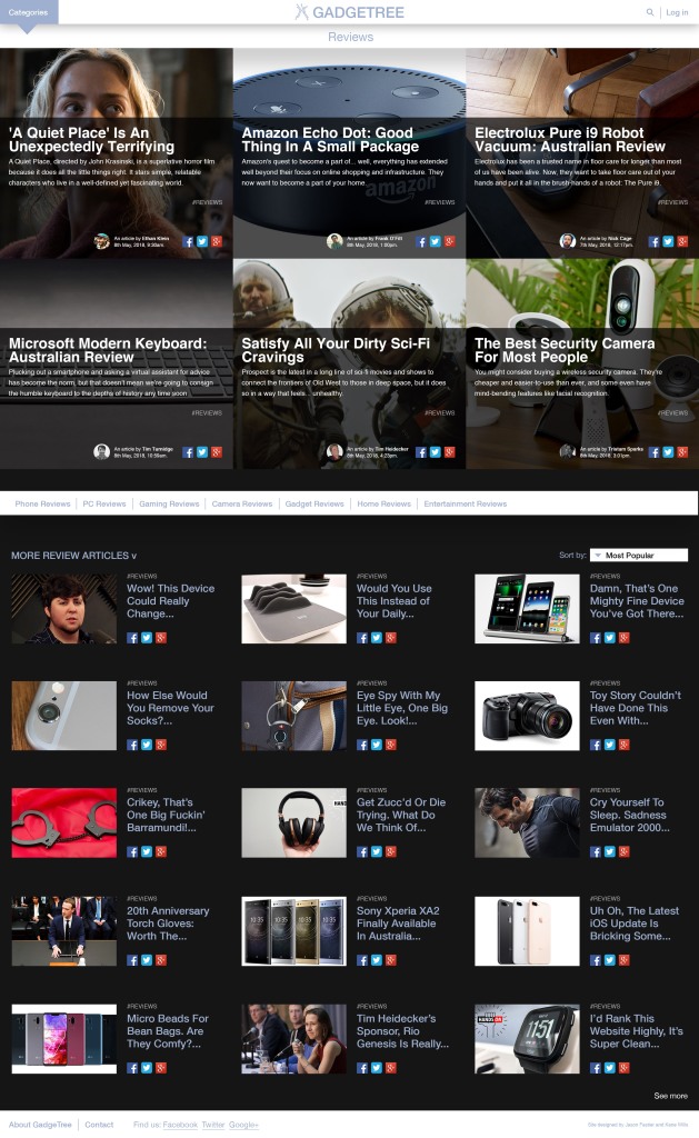
  • put the review subcategories at the top of the reviews category page rather than underneath the 6 featured review articles at the top (read ‘things we’d keep the same’ also).
  • Turn up the opacity of the blue of the drop-down category menu
  • Test some options for the layout of articles on the homepage (consider leaving gaps in some places to allow for visual ‘resting spaces’.
  • upsize the author/date/time text a touch (though not too much as it’s not supposed to be a feature of the page but rather necessary details to include)
  • Test some alternate placements and styles for the ‘sign up’ link/button/option

Things we’d keep the same:

From the ‘things that need work’ list, we think that the white text on the charcoal (not black) background is perfectly readable and the majority of people we’ve had use the site have never had an issue with it. We think it is perfectly readable.

We would also consider testing the review subcategory placement because we want to keep the same 6 featured articles at the top of all review and review sub-category pages. It seems annoying to have to scroll past the featured articles to get to the review type selected at the top of the page because those 6 articles won’t be specific to the selected subcategory. Our concern was that people wouldn’t see the smaller articles below the 6 big ones changing when they selected what review subcategory they wanted to explore. So, our solution was putting the review subcategories directly above the articles that would change when they selected their preferred review sub-category. Both options have their pitfalls.
Another option we could have considered for this would be the removal of the 6 featured articles at the top. We felt, however, that this would go against the style established on the homepage. We also like the look of those article thumbnails so that would also displease us as designers. We feel there is a way to make the page work whilst keeping the featured articles as they are.


31038484_581387912228208_7268440001891794944_n31120777_581387892228210_7697771100372992000_n

Final InVision Pages (desktop)

Below are the final images for the desktop InVision prototype (all the images I used to make the prototype).

We decided against prototyping several things as either the coded homepage shows them or they weren’t necessary for the user journeys. These were:

  • a clickable search bar
  • a clickable ‘see more’ button (on homepage and category pages)
  • all hover states (drop-down hover states and article thumbnail hover states are shown in the code)
  • a clickable ‘sort by’ option

-Kane

Adding a search bar (desktop)

One last thing some people suggested adding after the last crit was a search bar. We don’t think that we’ll use for a user journey purely on the basis that we don’t want our site to be a ‘search-to-find’ site but rather an ‘explore-to-find’ site. For this reason, we didn’t want to put emphasis the presence of the search bar.

Screen Shot 2018-04-21 at 1.37.59 PM

(Above: header with the search icon in place)

Screen Shot 2018-04-21 at 1.36.05 PM

(Above: search icon un-clicked)

Screen Shot 2018-04-21 at 1.36.23 PM

(Above: search icon clicked)


-Kane

Designing the Log in page (desktop)

Another thing people wanted to see during the last critique was perhaps a Log in journey. Since we have decided to make a user journey to show someone commenting, we thought it best to also show someone logging in to the site, as one must do that in order to comment (and also to opt-in to the email news update feature).

I didn’t look at too many examples of a log in page purely because I use them all the time and the visual language is very well known and consistent. I did make sure to check, however, that key secondary elements such as ‘forgot password’ and ‘forgot username’ and the link to the ‘Sign up’ page. I didn’t include a link to a privacy or terms and conditions page because I felt that would be found on the ‘Sign up’ page.

Here is the Google mail Log in page. I drew a little bit of inspiration from it in terms of its simplicity.

I felt like making the Log in page a separate page, (rather than a dropdown from the header) made a nicer journey.

sign in example

(Below: iterations from my Log in page design process)

Below is the final Log in page for the GadgeTree site. In the user journey, this page can be accessed from any page in the site but it will always take you back to homepage once you have logged in. IF GADGETREE WAS A REAL CODED SITE THIS WOULD NOT BE THE CASE. Instead, the user would be taken back to the page they were on so they could carry on with their business.

LOG IN FINAL

-Kane

Building the Comments section (desktop)

Screen Shot 2018-04-14 at 11.51.07 AMScreen Shot 2018-04-14 at 11.50.58 AM

Subsequent to receiving feedback stating that we should consider adding a comment section, we decided to add one. I had an idea of how I wanted it to look but needed to reference a couple of sites before making it as I wanted to ensure that the visual language was recognisable (or comparable with other comments sections) so that it was easy/natural for most people to use.

no comcom writtencom post

I thought it best to show the three states of the comments section (for someone using it): comment un-typed, comment typed and comment posted.

I also wanted to show what it looked like if someone had replied to a message so I thought about what other sites/forums do to stack replies and decided on making replies indented, as shown below (from the red iPhone article page).

Screen Shot 2018-04-21 at 12.36.09 PM

-Kane

Developing Category Menu Dropdown (post-crit)

After working on developing the Category Menu button I then shifted to working on a drop-down menu for it. These are the variations I whipped up. Jason and I agreed on the one displayed at the end because we felt it fitted best. We thought the variations with the semi-transparent black drop-down would clash too much with the article info segments which also have semi-transparent black. The drop-downs with the black rectangle hover states just didn’t look right and neither did any with opaque drop-downs. The one Jason and I picked as an 85% opaque blue background with opaque white category options, the hover state being an opaque white rectangle, with opaque blue text (the dropdown width is a sixth of the page width but I’m not sure how this will change when it comes to having a responsive webpage. This is something we will figure out when we come to coding it).

-Kane

screen-shot-2018-03-27-at-11-43-23-am.png

Screen Shot 2018-03-31 at 3.05.30 PM

Developing Category Menu Button (post-crit)

Today in class, I decided to work on one of the biggest flaws of our desktop site (based on the critique feedback): the ‘Categories’ button. I came up with a handful of variations and then Jason and I discussed what worked best and why (whilst also looking at them in the context of the whole webpage to test balance, hierarchy and how well the button communicated its function. We ended up deciding that the last one (bottom right) was the best choice so my next step is to design a drop-down menu which fits the button as we think the one we had previously doesn’t tie with it very well.

-Kane

Screen Shot 2018-03-31 at 2.47.08 PM

Final User Personae

Kane + Jason

kane-wills-1200x800

KANE WILLS

Age: 20

Gender: Male

Ethnic Group: NZ European

Personal Statement: “I find tech generally fascinating but I tend to delve into the computer, mobile and gaming tech realms more than anything else.”

Role: Often a grazer but when thinking of making a tech purchase he will look at many sites for info (reviews). Will spend more time on a site of it’s ‘well designed’, easy to use and easy on the eye.

Occupation: Full-time student.

Lives: In Wellington, New Zealand in a flat with two other somewhat tech-savvy students.

Access: Will more than often view websites on his laptop but if a website is designed well for mobile he will more inclined to use that device.

Languages: English

Kieran

JASON SALLINGRICH

Age: 20

Gender: Male

Ethnic Group: NZ European

Personal Statement: “ I am quite interested in tech, specifically computer hardware/ components and accessories as well as gaming.”

Role: I like to be kept up to date with tech news without always having to search for the latest news.

Occupation: Full-time student

Lives: In Wellington, New Zealand in a flat with two other somewhat tech-savvy students.

Access: Preferably on desktop screen but often on a laptop. Generally will avoid visiting on mobile.

Languages: English

JASE DAWGYYY

JASON FASTIER

Age: 55

Gender: Female

Ethnic Group: NZ European

Personal Statement: “I see lots of things on Facebook about these Amazon products and this thing called the “Alexa” so I went to look on a tech website to find out more.”

Role: Often is on Facebook (replying LOL to her friends status’) and checking her emails.

Occupation: Accountant

Lives: At home with husband and kids (2 girls, 1 boy).

Access: Through the family’s shared computer (when husband Steve isn’t checking the emails).

Languages: English, (took French in high school but didn’t get very far)

Holly

HOLLY WILLS

Age: 17

Gender: Female

Ethnic Group: NZ European

Personal Statement: “I have barely any interest in tech stuff. I would probably just browse the homepage and find something there.”

Role: Browses the internet to procrastinate.

Occupation: College Student

Lives: At home with her parents and sister. Likes to walk to a lot of the places she needs to go.

Access: Uses her phone all the time so naturally views websites via that device.

Languages: English, learning Spanish

javi

JAVI MEHLIANA

Age: 29

Gender: Male

Ethnic Group: Argentinian

Personal Statement: “I’m looking for a new laptop because I had to leave my other one behind when I immigrated from Argentina.”

Role: Uses free WiFi at public libraries to search for a new computer.

Occupation: Working as a fruit picker.

Lives: Backpacking around New Zealand until he earns enough to purchase his own place.

Access: Uses phone and connects to free public wifi (often at town libraries).

Languages: Portuguese, Fluent in English

haiyan1

HAIYAN CHEN

Age: 73

Gender: Female

Ethnic Group: Chinese

Personal Statement: “我正在看一個食譜,我不 知道我是怎麼來到這裡的!” “I was looking at a recipe, I don’t know how I got here!”

Role: Pretty unfamiliar with the internet, it’s a new experience for her and she’s not enjoying it yet she is curious about it.

Occupation: Retired, occasionally works at takeaway shop her family owns.

Lives: At home with one of her children who looks after her

Access: Occasionally uses her child’s smartphone to look up recipes.

Languages: Mandarin, a little Cantonese and broken English

Desktop Invision pages for Informal Critique

For this critique, I put together a home page, category page and an article page so that we had one user journey to test in class. I spent a while on these pages ensuring that the layout was similar to that which we intend for the final pages. I did this so that the feedback we got was helpful for refining details in the hierarchy and navigation alongside our vision for the site.

https://invis.io/FNGHJYKM5WH

Home

computing Page

GPU Article

Desktop Article Page Format Developments

Here, I was trying to find a good place to show which article page/category the user is on. Initially, I had the category title to the right of the GadgeTree branding but I decided on shifting it to sit beside the categories menu because I felt that made more sense. There is now more of a natural flow from the category menu to the category the user is on.


Kane