Rationale & Invision links

Rationale

We were tasked with the project of reinventing the ‘stuff’ news website, however, we decided to instead focus on technology centred news websites, as this is an interest of us both. We took this opportunity to design a tech website from the point of view of us as tech enthusiasts, based on what we would be looking for in such a site. Overall, we found that many news websites were too cluttered and busy, which made them difficult to look at and confusing to navigate. We aimed to simplify our design down to the essentials for easy content navigation.

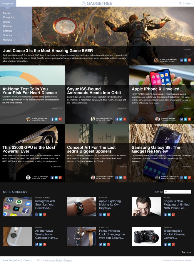
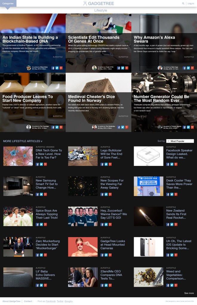
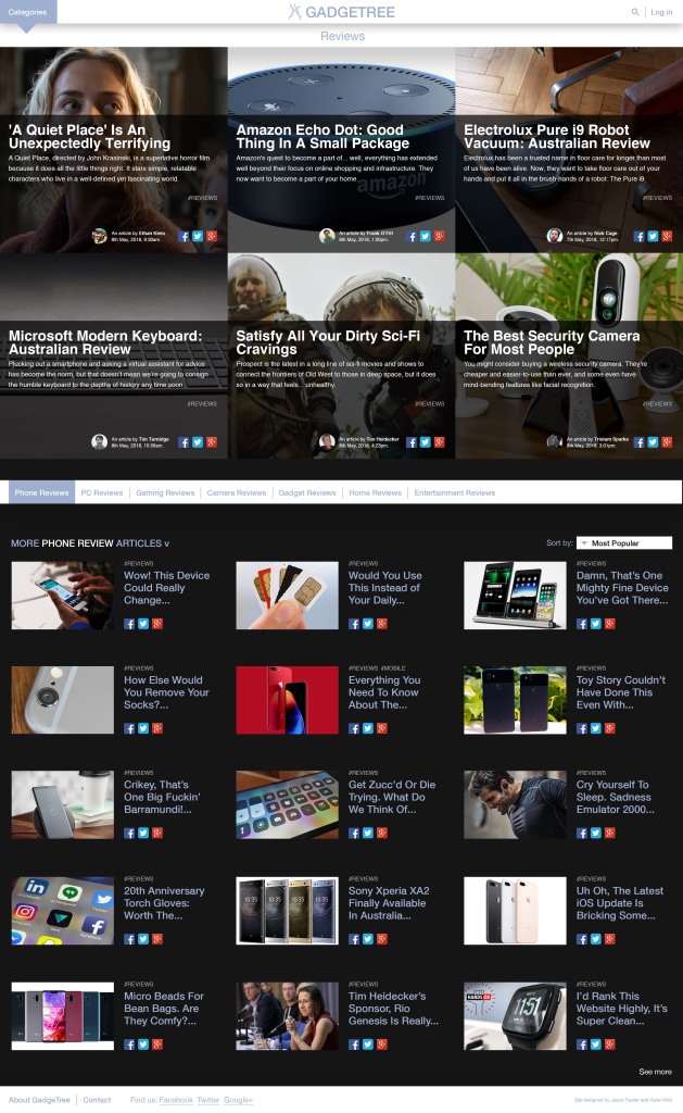
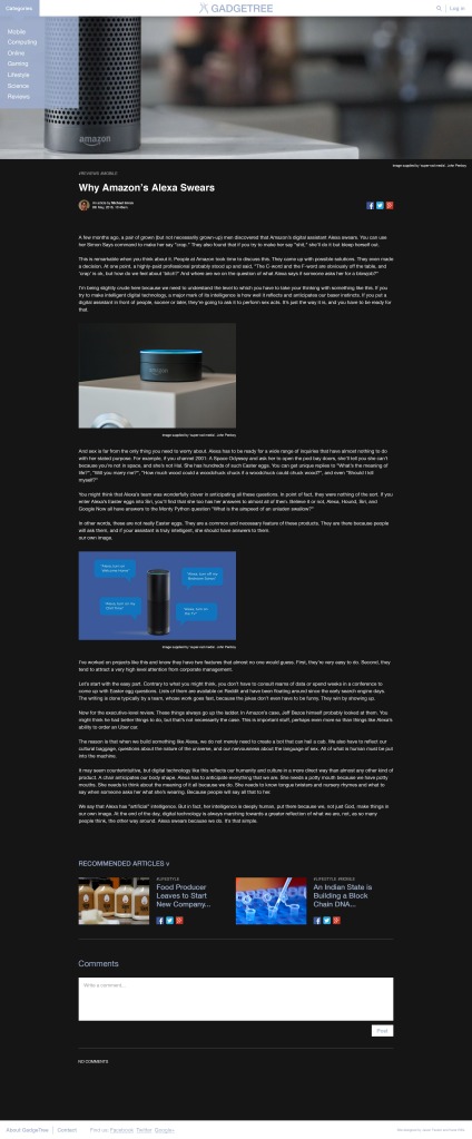
The GadgeTree website has a clean, modern aesthetic which uses hard lines, a sans-serif (Helvetica) typeface and blue to tie with what we felt the word ‘technology’ evokes. We gave a lot more hierarchy to imagery because we felt that it was more engaging and easy to read than strings of words. We also employed a minimal 2 to 3 ‘tiers’ of hierarchy between the article ‘thumbnails’ through use of scale in the layout to bring attention towards more important and interesting articles while also having smaller sections to allow a range of content.

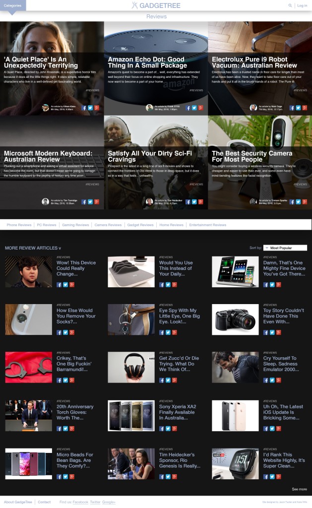
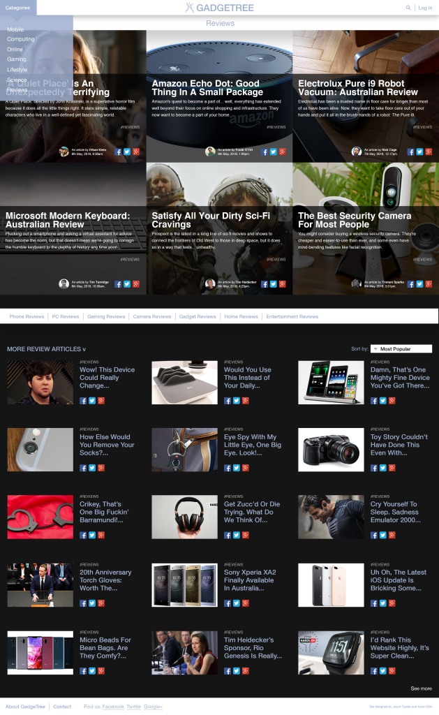
Given more time we have made some changes to the mobile layout especially. We realised after our last point of feedback that the social media icons on the mobile layout are far too dominant and unnecessary. We also found that the review page subcategory menu in the desktop layout should have been placed at the top and would instead filter the main articles.


Invision

Mobile
https://projects.invisionapp.com/share/SDH8349EM7A#/screens

Desktop
https://projects.invisionapp.com/share/P9H7YJ2K3ZC#/screens

Invision prototype – Mobile

In class we presented this invision prototype for critique.

Prototype version incorporating our 3 mobile user journeys

https://invis.io/DQH9KADP8JB#/291339485_Lifestyle

Home, before/after clicking see more.

The ‘see more’ button is different in this one because I updated it immediately after class based on feedback and did not keep the old version.

How it looked before feedback –

Computing

We found from feedback however that the ‘see more’ button was too small and hard to spot which confused a lot of people, so I made it a larger font and placed it in the middle.

Home

HomeMore

Category page – Computing (left) and Computing article (Right)

Showing the template for what a category page and article page looks like on mobile – also on article page includes a preview of the comment section.

NB: I missed updating the ‘see more’ button on these pages with the correct size and positioning, on the home page is the definitive look.


Computing ArticleComputing


Feedback from class

Final prototype feedback


From feedback – Two common feedback points which were agreed on by many people were the issues with the see more button and the social media links. Most thought that the see more button was too small to notice, which has been fixed.

The other point was that a lot of people questioned the social media links and thought that they were unnecessary. Looking at the mobile layout now we realize that the social media links have become very dominant and very much take over the atheistic of the layout which would look much better without them there.

The reason this happened is because we have the social media links in the desktop version and they work well we think, so we wanted to put them into the mobile version as well. However, we had to make them very large to be comfortably clickable on a mobile device and as such became far too much.

If we had time to change this we would either remove them from the mobile version and only have them on the article page, or we would condense them to one share button so it would be far less intrusive.

Share icon.png

We would have this in the place of the facebook, twitter and instagram icons instead, which is a commonly used share icon on websites.

Week 6 Critique (desktop)

-Kane

Feedback

Today, we received a lot of great feedback on our website prototypes. Normally, this would be a blessing, but with the deadline looming (and other subjects to work on) we don’t have time to make the changes we would otherwise. This is really disappointing for us because we know our site could be that much better. Nevertheless, this is the feedback we received:

Things that are good:

  • comment feature looks good (x3)
  • category hashtags work well
  • easy to find and find and use the login page (x3)
  • easy to find the review
  • nicely designed article page
  • great navigational flow

Things that need work:

  • white on black article text hard to read
  • author/date/time text too small (x2)
  • ‘sign up’ text on login page quite small
  • text hard to read on category drop-down
  • hard to find the phone review (x2)
  • homepage feels overwhelming

What we would change:

  • put the review subcategories at the top of the reviews category page rather than underneath the 6 featured review articles at the top (read ‘things we’d keep the same’ also).
  • Turn up the opacity of the blue of the drop-down category menu
  • Test some options for the layout of articles on the homepage (consider leaving gaps in some places to allow for visual ‘resting spaces’.
  • upsize the author/date/time text a touch (though not too much as it’s not supposed to be a feature of the page but rather necessary details to include)
  • Test some alternate placements and styles for the ‘sign up’ link/button/option

Things we’d keep the same:

From the ‘things that need work’ list, we think that the white text on the charcoal (not black) background is perfectly readable and the majority of people we’ve had use the site have never had an issue with it. We think it is perfectly readable.

We would also consider testing the review subcategory placement because we want to keep the same 6 featured articles at the top of all review and review sub-category pages. It seems annoying to have to scroll past the featured articles to get to the review type selected at the top of the page because those 6 articles won’t be specific to the selected subcategory. Our concern was that people wouldn’t see the smaller articles below the 6 big ones changing when they selected what review subcategory they wanted to explore. So, our solution was putting the review subcategories directly above the articles that would change when they selected their preferred review sub-category. Both options have their pitfalls.
Another option we could have considered for this would be the removal of the 6 featured articles at the top. We felt, however, that this would go against the style established on the homepage. We also like the look of those article thumbnails so that would also displease us as designers. We feel there is a way to make the page work whilst keeping the featured articles as they are.


31038484_581387912228208_7268440001891794944_n31120777_581387892228210_7697771100372992000_n

Coding progress

Progress on coding the homepage – Header all in place and everything is sitting where it should.

Capture

Capture2

Here I am just working on arranging the description text for the article thumbnails into place.

Capture3

Had some issues with resizing and how to arrange the social media and author information when the window got too small.

– Jason

Mobile dropdown development

dropdown3


Tried out transparency like on the desktop version. We were originally going to leave transparency out of the mobile version because it felt like it made more sense to be block colour and transparency is less common on mobiles layout

dropdown4

Dropdown final


Once I looked at the layout on my phone I realised that the font was too small to be comfortable on a mobile screen. We tried a few different iterations and layouts before finally coming to a final.

– Jason


Final InVision Pages (desktop)

Below are the final images for the desktop InVision prototype (all the images I used to make the prototype).

We decided against prototyping several things as either the coded homepage shows them or they weren’t necessary for the user journeys. These were:

  • a clickable search bar
  • a clickable ‘see more’ button (on homepage and category pages)
  • all hover states (drop-down hover states and article thumbnail hover states are shown in the code)
  • a clickable ‘sort by’ option

-Kane

Adding a search bar (desktop)

One last thing some people suggested adding after the last crit was a search bar. We don’t think that we’ll use for a user journey purely on the basis that we don’t want our site to be a ‘search-to-find’ site but rather an ‘explore-to-find’ site. For this reason, we didn’t want to put emphasis the presence of the search bar.

Screen Shot 2018-04-21 at 1.37.59 PM

(Above: header with the search icon in place)

Screen Shot 2018-04-21 at 1.36.05 PM

(Above: search icon un-clicked)

Screen Shot 2018-04-21 at 1.36.23 PM

(Above: search icon clicked)


-Kane

Designing the Log in page (desktop)

Another thing people wanted to see during the last critique was perhaps a Log in journey. Since we have decided to make a user journey to show someone commenting, we thought it best to also show someone logging in to the site, as one must do that in order to comment (and also to opt-in to the email news update feature).

I didn’t look at too many examples of a log in page purely because I use them all the time and the visual language is very well known and consistent. I did make sure to check, however, that key secondary elements such as ‘forgot password’ and ‘forgot username’ and the link to the ‘Sign up’ page. I didn’t include a link to a privacy or terms and conditions page because I felt that would be found on the ‘Sign up’ page.

Here is the Google mail Log in page. I drew a little bit of inspiration from it in terms of its simplicity.

I felt like making the Log in page a separate page, (rather than a dropdown from the header) made a nicer journey.

sign in example

(Below: iterations from my Log in page design process)

Below is the final Log in page for the GadgeTree site. In the user journey, this page can be accessed from any page in the site but it will always take you back to homepage once you have logged in. IF GADGETREE WAS A REAL CODED SITE THIS WOULD NOT BE THE CASE. Instead, the user would be taken back to the page they were on so they could carry on with their business.

LOG IN FINAL

-Kane